Gold Coast
Web Design And Digital Marketing Experts
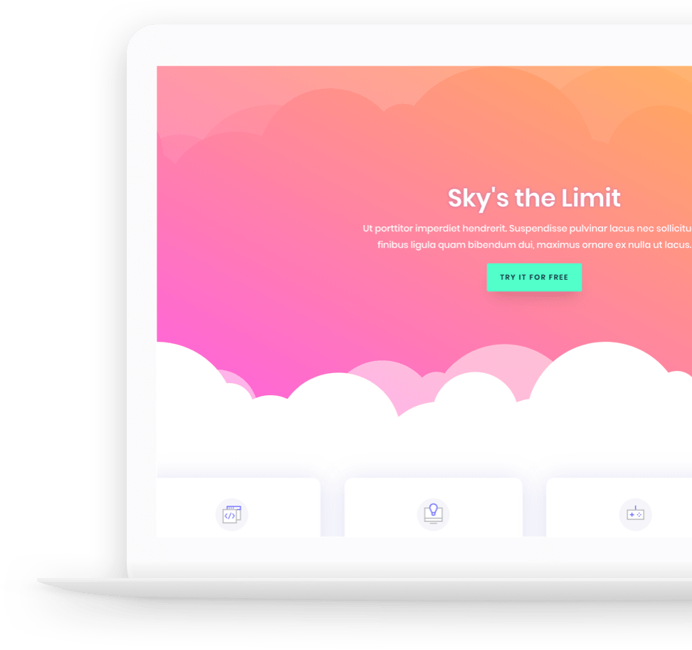
If you’re ready for an amazingly beautiful website or a wildly successful digital marketing strategy you’ve come to the right place…

Get Started For Free!
It doesn’t cost you to look into your options, schedule a call and one of our experts will prove to you why you need us to handle your digital solutions.
We’ve Got You Covered
Design
We’ll design beautiful web and print solutions for you.
Social Media Management
Organic and paid social media management to drive engagement and conversions.
Analytics
Qualitative and quantitative analytics to drive data based decisions.
SEO
We’ll rank your website to first position for your target keywords.
Copywriting And Content
Our copywriters and bloggers will produce all your online content.
Software Engineering
We’ll scope custom software requirements to deliver a clean coded platform.
Website Development
HTML, CSS, WordPress, Shopify… You name it we’ll build it.
Digital Marketing
We’ll use digital marketing to meet your KPI’s
We’ll Show You How It’s Done
Look, the first thing you need to understand is your business goals. The second thing is your customers. We’ll work with you to identify all the elements of your business and how they tie together with your overall goals. Once we’ve identified everything required, we’ll implement a data driven strategy utilising existing client data and optimised offers and processes to create an online environment your customers feel comfortable transacting in.

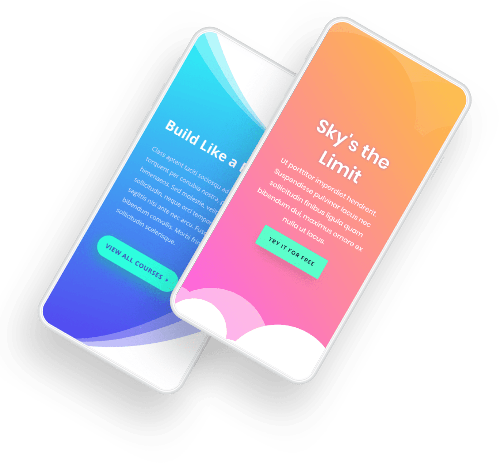
Responsive Design For A Mobile First World
Your potential customers are looking at you on their smartphones.
You need to have a mobile first environment to move these potential customers from browsers to customers to brand ambassadors.
By fostering a positive user experience, “you’re gonna have a good time”…
Recent Work
Check Out Some Of Our Latest Projects

Our Latest Articles
Three Things You Need To Know About AdWords
There are literally hundreds, if not thousands of how-to guides out there written by experts and savvy bloggers, and even Google itself. Despite that, the advertising giant has things that are either rarely talked about, or most people are simply not aware of. AdWords...
Why Every Business Needs A Good-Looking and Responsive Website Design
Whether you think it’s fair or not, people will judge us the way we look. Same goes with business companies – they are judged based on the quality of their website. Web design is like packaging design for consumer goods. In most cases, people are more influenced by...
How Link Building Works for SEO
It is almost impossible to talk about Search Engine Optimization without mentioning link building, and for obvious reason – Off Page SEO plays a key role in Google’s algorithm. Those new to SEO may find the concept of link building daunting, so in this entry, we will...
Case Study
$70,000 In Four Months From $10 Per Day On Ads…


